Candlestick charts are one of the most popular tools used by traders to analyze price movements in the financial markets.
Among the different chart styles available, the red and green candlestick chart is the most widely used because it allows traders to instantly distinguish between bullish and bearish price action.
By simply looking at the color of a candle, traders can quickly determine whether buyers or sellers were in control during a specific period.
This makes red and green candlestick charts an essential tool for understanding market sentiment, identifying trends, and making better trading decisions.
In this guide, you’ll learn what a red and green candlestick chart is, what the different candle colors mean, how to read these charts, and how traders use them to analyze the markets.
What Is a Red and Green Candlestick Chart?

A red and green candlestick chart is a type of financial chart that uses different colors to distinguish between bullish and bearish price movements during a specific period.
In most trading platforms, a green candlestick indicates that the price closed higher than it opened, while a red candlestick shows that the price closed lower than it opened.
Traders use red and green candlestick charts because they allow them to quickly identify who is in control of the market.
A series of green candles suggests strong buying pressure and bullish sentiment, whereas multiple red candles indicate selling pressure and bearish sentiment.
The colors of candlesticks also help traders understand the psychology behind price movements in just a few seconds, making candlestick charts one of the most popular tools in technical analysis.
Although traders can customize the colors of their charts according to their preferences, the red and green color scheme remains the most widely used and recognized version of candlestick charts worldwide.
What Does a Green Candlestick Mean?

A green candlestick means that the closing price is higher than the opening price, indicating that buyers were in control of the market during that specific timeframe. In other words, a green candle represents bullish sentiment and buying pressure.
The size of the green candle can provide additional information about the strength of buyers. A large green candlestick suggests that buyers are aggressive and willing to push prices significantly higher.
On the other hand, a small green candle indicates that buyers still have control, but their momentum is relatively weak.
The wicks of a green candlestick also reveal valuable information about market psychology. A green candle with long upper or lower wicks shows that buyers faced resistance from sellers during the period, creating price fluctuations before the candle closed.
In contrast, a green candle with little or no wicks indicates that buyers maintained control throughout the session with minimal selling pressure.
By analyzing the body and wicks of a green candlestick, traders can better understand the balance between buyers and sellers and assess the strength of the current bullish move.
What Does a Red Candlestick Mean?

A red candlestick means that the closing price is lower than the opening price, indicating that sellers were in control of the market during that specific timeframe. In other words, a red candle represents bearish sentiment and selling pressure.
The size of the red candlestick can reveal the strength of the sellers. A large red candle suggests that sellers are aggressive and willing to drive prices significantly lower.
Conversely, a small red candle indicates that sellers still have control, but their momentum is relatively weak.
The wicks of a red candlestick also provide valuable insights into market psychology. A red candle with long wicks shows that buyers attempted to push prices higher or defend lower prices, creating resistance against the sellers.
In contrast, a red candlestick with little or no wicks indicates that sellers maintained control throughout the entire period with minimal buying pressure.
By analyzing both the body and the wicks of a red candlestick, traders can better understand the balance between buyers and sellers and evaluate the strength of the current bearish move.
How to Read a Red and Green Candlestick Chart

Reading a red and green candlestick chart may seem difficult at first, but once you understand what each part of a candlestick represents, you can quickly determine who is in control of the market and how strong that control is.
When analyzing a candlestick chart, there are four important elements to consider:
- The color of the candle
- The size of the body
- The wicks or shadows
- The sequence of multiple candles
1. Look at the Color of the Candlestick
The first thing you should do is look at the color of the candle.
A green candlestick means that the closing price is higher than the opening price, indicating that buyers controlled the market during that period.
A red candlestick means that the closing price is lower than the opening price, showing that sellers were in control of the market.
The color of the candlestick allows traders to instantly identify market sentiment without having to look at the exact prices.
2. Analyze the Size of the Candle’s Body
The body of the candlestick is the area between the opening and closing prices. The size of the body tells you how aggressive buyers or sellers were during the trading period.
Large Green Body
A large green candle indicates strong buying pressure. Buyers dominated the session and managed to push prices significantly higher from the opening price.
This usually suggests strong bullish momentum and often appears during strong uptrends or after a breakout.
Small Green Body
A small green candle indicates that buyers are still in control, but their momentum is weaker. The market moved higher, but buyers were unable to make a significant advance.
Large Red Body
A large red candle shows aggressive selling pressure. Sellers controlled the market and pushed prices sharply lower.
This often indicates strong bearish momentum and may appear during downtrends or after a support level breaks.
Small Red Body
A small red candle suggests that sellers have control, but their momentum is limited. The decline is relatively weak, and buyers may still be present in the market.
3. Study the Wicks or Shadows
The wicks, also called shadows, represent the highest and lowest prices reached during a specific period.
The upper wick shows the highest price that the market traded at before pulling back.
The lower wick shows the lowest price reached before the market recovered.
Wicks provide valuable information about the battle between buyers and sellers.
Long Upper Wick
A long upper wick indicates that buyers pushed prices higher but were unable to maintain those gains because sellers stepped in and drove prices lower.
Long Lower Wick
A long lower wick indicates that sellers pushed prices lower, but buyers entered the market and rejected those lower prices.
Candles With Little or No Wicks
Candlesticks with very small or no wicks indicate strong control by one side of the market.
- A green candle with no wicks suggests that buyers controlled the entire session with very little resistance from sellers.
- A red candle with no wicks suggests that sellers dominated the market with little buying pressure.
4. Analyze Multiple Candlesticks Together
A single candlestick provides useful information, but several candlesticks together tell a much bigger story.
Multiple Green Candles
A series of consecutive green candles usually indicates an uptrend. Buyers are consistently willing to pay higher prices, and bullish momentum is increasing.
The larger the green candles become, the stronger the buying pressure tends to be.
Multiple Red Candles
A series of consecutive red candles usually indicates a downtrend. Sellers are dominating the market and continuously pushing prices lower.
The larger the red candles become, the stronger the bearish momentum tends to be.
Why Reading Candlestick Charts Matters
By analyzing the color, body size, wicks, and sequence of candlesticks, traders can quickly understand:
- Who is controlling the market.
- The strength of buyers and sellers.
- Whether momentum is increasing or weakening.
- If the market is trending or potentially reversing.
Learning how to read a red and green candlestick chart is one of the most important skills in technical analysis because it allows traders to understand market psychology and make better trading decisions.
Red and Green Candlestick Patterns
Red and green candlesticks become even more powerful when they form specific patterns. While a single candle can reveal who controlled the market during a particular period, multiple candles can provide deeper insights into market psychology, momentum, and potential trend reversals.
Some candlestick patterns can even generate high-probability buy and sell signals when they appear in the right market conditions, such as near support and resistance levels, after a prolonged trend, or in combination with other technical analysis tools.
Three White Soldiers Pattern
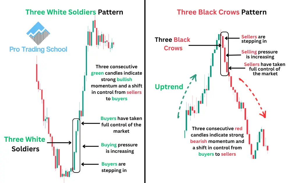
The Three White Soldiers pattern consists of three consecutive green candlesticks that close progressively higher. This pattern indicates that buyers have taken control of the market and are consistently pushing prices upward.
The psychology behind this pattern is straightforward. During each trading session, buyers are willing to pay increasingly higher prices, showing strong bullish conviction and increasing demand.
The Three White Soldiers pattern often appears after a downtrend or at the end of a market correction and can signal the beginning of a new bullish trend. When this pattern forms near a major support level or after a period of market weakness, it can provide a high-probability buy signal.
To learn more about this pattern and how to trade it effectively, read our complete guide to the Three White Soldiers pattern.
Three Black Crows Pattern
The Three Black Crows pattern is the opposite of the Three White Soldiers pattern. It consists of three consecutive red candlesticks that close progressively lower.
This pattern indicates that sellers have gained control of the market and are aggressively pushing prices downward. Each candle shows that sellers are willing to accept lower prices, demonstrating strong bearish sentiment.
The Three Black Crows pattern often appears after an uptrend and may signal the beginning of a bearish reversal. When it forms near a major resistance level or after an extended rally, it can provide a high-quality sell signal.
To learn more about this bearish reversal pattern and how traders use it to identify potential market tops, read our complete guide to the Three Black Crows pattern.
Bullish Engulfing Pattern
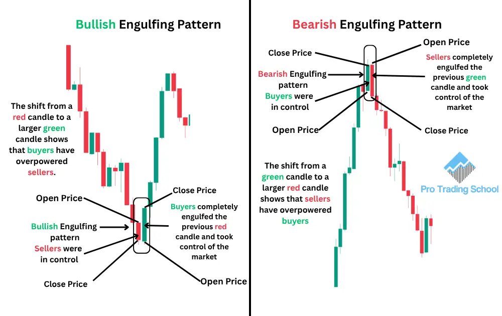
The Bullish Engulfing pattern is a two-candle reversal pattern. It forms when a red candle is immediately followed by a larger green candle that completely engulfs the body of the previous red candle.
This pattern indicates that buyers have overwhelmed sellers and taken control of the market. The strong buying pressure suggests that market sentiment may be shifting from bearish to bullish.
The psychology behind the pattern is that sellers initially push prices lower, but buyers suddenly step in with enough strength to erase the entire previous decline.
When the Bullish Engulfing pattern appears after a downtrend, at a support level, or near a demand zone, it can provide a high-probability bullish reversal signal.
To see how this pattern forms in real market conditions, explore our 8 Powerful Bullish Engulfing Pattern Chart Examples and learn how traders use it to identify potential buying opportunities.
Bearish Engulfing Pattern
The Bearish Engulfing pattern is also a two-candle reversal pattern, but it signals potential downside movement.
It forms when a green candle is followed by a larger red candle that completely engulfs the body of the previous green candle.
This pattern indicates that sellers have gained control and overwhelmed buyers. The shift in momentum suggests that bullish sentiment is weakening and that prices may begin moving lower.
The Bearish Engulfing pattern is particularly powerful when it forms at the top of an uptrend, near a resistance level, or within a supply zone. In these situations, it can provide a high-probability sell signal and indicate the beginning of a bearish reversal.
To see how this pattern appears in real market conditions, explore our 12 Bearish Engulfing Pattern Examples (Real Chart) and learn how traders use it to identify potential market tops and selling opportunities.
Why These Patterns Matter
As you can see, red and green candlesticks are much more than simple colors on a chart. They provide valuable information about the battle between buyers and sellers, reveal market psychology, and help traders identify potential buying and selling opportunities.
By learning to recognize these candlestick patterns and understanding the psychology behind them, traders can make better decisions and improve their ability to anticipate future price movements.
Frequently Asked Questions (FAQs)
Are green candlesticks always bullish?
No. A green candlestick simply means that the price closed above its opening price during a specific period.
Although it shows that buyers had control during that session, it does not guarantee that the market will continue moving higher. Traders should always analyze the broader trend and other technical factors before making a trading decision.
Why do some trading platforms use different candle colors?
Most platforms use green and red because they are easy to understand visually. However, traders can customize the colors according to their preferences.
For example, some traders use white and black candles or blue and red candles. The meaning of the candles remains the same regardless of the colors used.
Can a single candlestick predict the next market move?
No single candlestick can predict the future with certainty. Candlesticks provide clues about market sentiment and the balance between buyers and sellers, but they work best when combined with chart patterns, support and resistance levels, and other technical analysis tools.
Which timeframe is best for reading red and green candlestick charts?
Red and green candlestick charts can be used on any timeframe, from one-minute charts to monthly charts.
However, higher timeframes generally provide more reliable signals because they contain more market data and are less affected by short-term price fluctuations.
Why are candlestick charts more popular than line charts?
Candlestick charts provide significantly more information than line charts. Besides showing the closing price, they also display the opening, high, and low prices for a specific period, allowing traders to better understand market psychology and price action.
Do long wicks always signal a reversal?
Not necessarily. Long wicks indicate that one side of the market rejected certain price levels, but they do not automatically mean that a reversal will occur. The significance of a long wick depends on where it appears on the chart and the overall market context.
Can beginners learn candlestick charts easily?
Yes. One of the main reasons candlestick charts are so popular is their simplicity. Beginners can quickly learn how to identify bullish and bearish candles and gradually develop a deeper understanding of candlestick patterns and market psychology.
Are candlestick patterns enough to build a profitable trading strategy?
Candlestick patterns can be a valuable part of a trading strategy, but they should not be used in isolation. Successful traders typically combine candlestick analysis with risk management, trend analysis, and other technical tools to improve the probability of success.